UserExperience: Difference between revisions
Jump to navigation
Jump to search
(→Todo) |
(big update: hashed out what the "team" is doing right now and other projects we should probably tackle next) |
||
| Line 1: | Line 1: | ||
The User Experience team | The User Experience team develops art, CSS, and other UI elements and is connected with the Dev team. Take a look around at what we are working on currently and what we'd like to start working on next, if you see anything you might be able to help with just contact '''style@soylentnews.org'''. | ||
'''See also: [[Style]]''' | '''See also: [[Style]]''' | ||
| Line 31: | Line 31: | ||
|} | |} | ||
<section end=whoarewe /> | <section end=whoarewe /> | ||
==Current Projects== | |||
[[File:Appleicon152px.png|thumbnail|right|This is the apple touch icon 152x152px which might work for some products but it's too small for print.]] | |||
===Soylent Swag=== | |||
*variations on logos for different products | |||
*flesh out the store with more options | |||
*come up with SN memes or nerdy sayings for products | |||
*need a square logo or "SN" for square products (see example right) | |||
**working with prospectacle on a monogram-type idea for subtle more formalwear | |||
===Topic Icons=== | |||
*rand submitted a bunch of original topic icons | |||
**need to test on dev server (awaiting merge) | |||
**may need to add some new topics (work with Editor's Team) | |||
==Todo== | ==Todo== | ||
*new logo | *new logo for cross-theme compatibility | ||
*update the comment expand/collapse buttons (cross-theme compatibility) | *update the comment expand/collapse buttons (cross-theme compatibility) | ||
*update the fried/foe icons | *update the fried/foe icons | ||
*Define single column layout requirements - | *Define single column layout requirements - see: [http://i.imgur.com/WVDZiAy.png this mobile layot sketch] linked on the [[MobileDesign| Mobile Design]] page. | ||
*Typographic and typesetting guidelines (with LaminatorX) - awaiting feature request, then work with CSS ppl on a specification | *Typographic and typesetting guidelines (with LaminatorX) - awaiting feature request, then work with CSS ppl on a specification | ||
*Weekly comic | *Weekly comic | ||
Revision as of 05:08, 20 July 2014
The User Experience team develops art, CSS, and other UI elements and is connected with the Dev team. Take a look around at what we are working on currently and what we'd like to start working on next, if you see anything you might be able to help with just contact style@soylentnews.org.
See also: Style
There's a lot of documentation on CSS work being done and you can find some notes on future UI Design here.
Who we are
| User Experience Team Main Page | ||
|---|---|---|
|
nick |
position |
timezone |
| mrcoolbp | Interim Leader | UTC-5 |
| audioguy | On Occasional Loan | UTC-8 (PST) |
| FrogBlast | Art Team | ? |
Current Projects

Soylent Swag
- variations on logos for different products
- flesh out the store with more options
- come up with SN memes or nerdy sayings for products
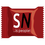
- need a square logo or "SN" for square products (see example right)
- working with prospectacle on a monogram-type idea for subtle more formalwear
Topic Icons
- rand submitted a bunch of original topic icons
- need to test on dev server (awaiting merge)
- may need to add some new topics (work with Editor's Team)
Todo
- new logo for cross-theme compatibility
- update the comment expand/collapse buttons (cross-theme compatibility)
- update the fried/foe icons
- Define single column layout requirements - see: this mobile layot sketch linked on the Mobile Design page.
- Typographic and typesetting guidelines (with LaminatorX) - awaiting feature request, then work with CSS ppl on a specification
- Weekly comic